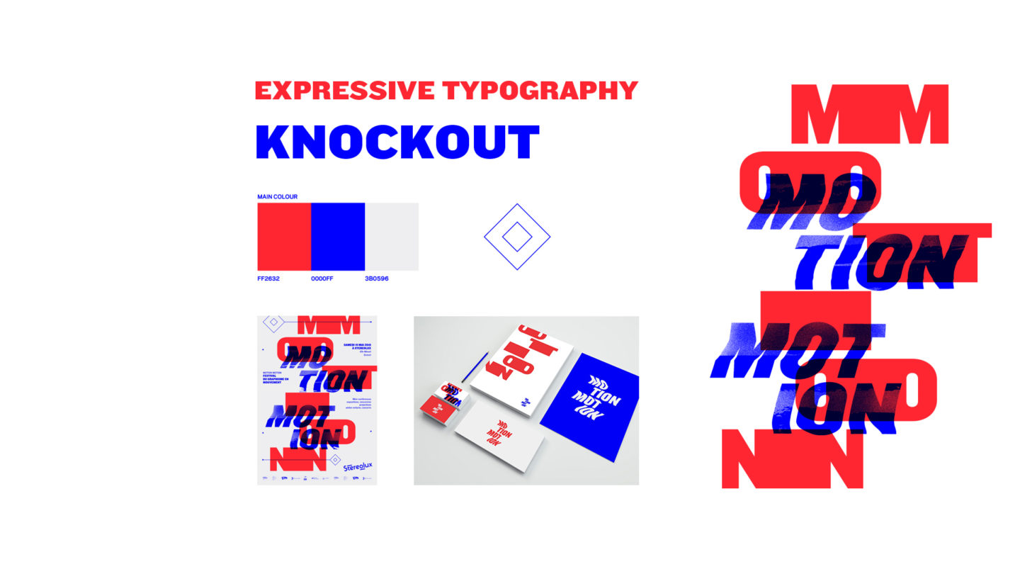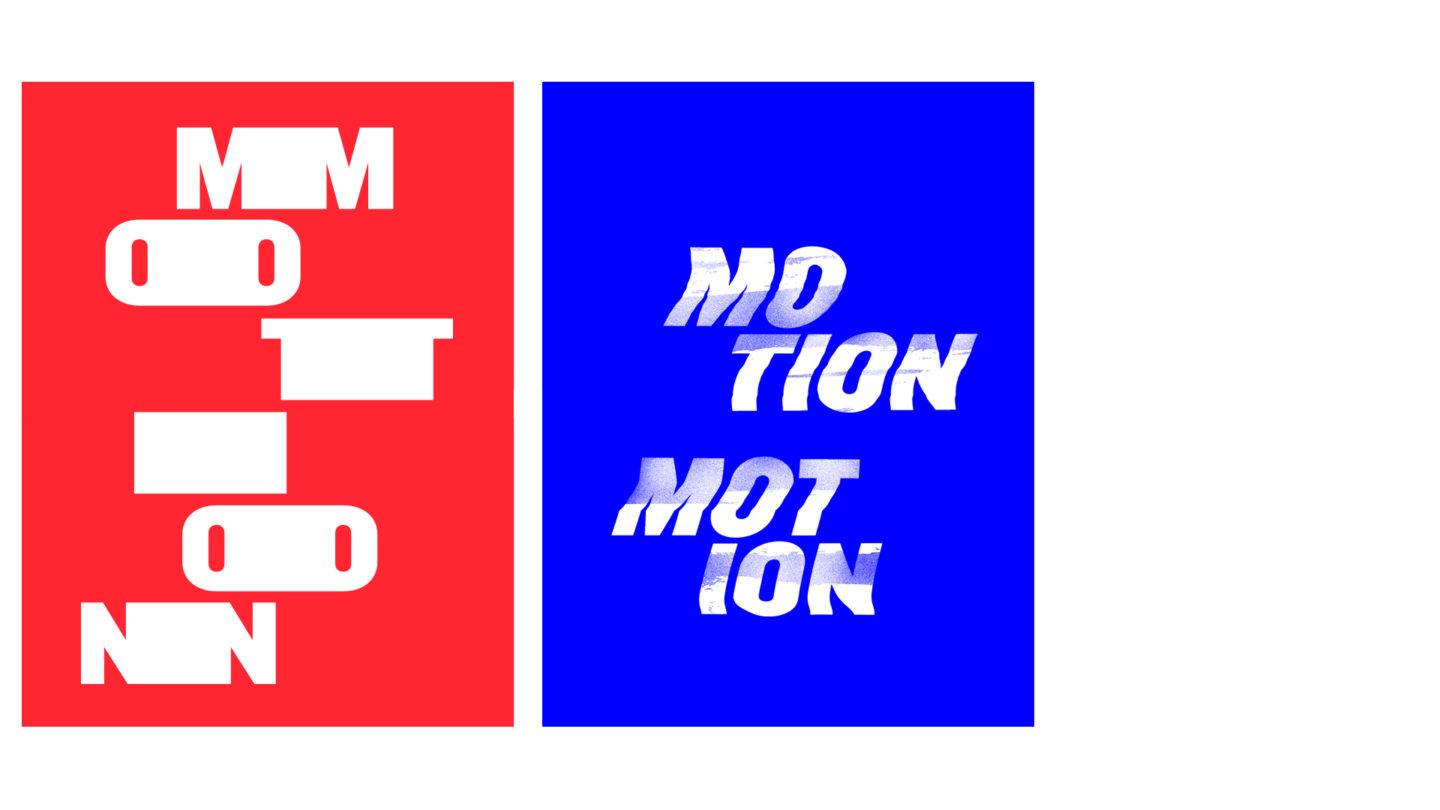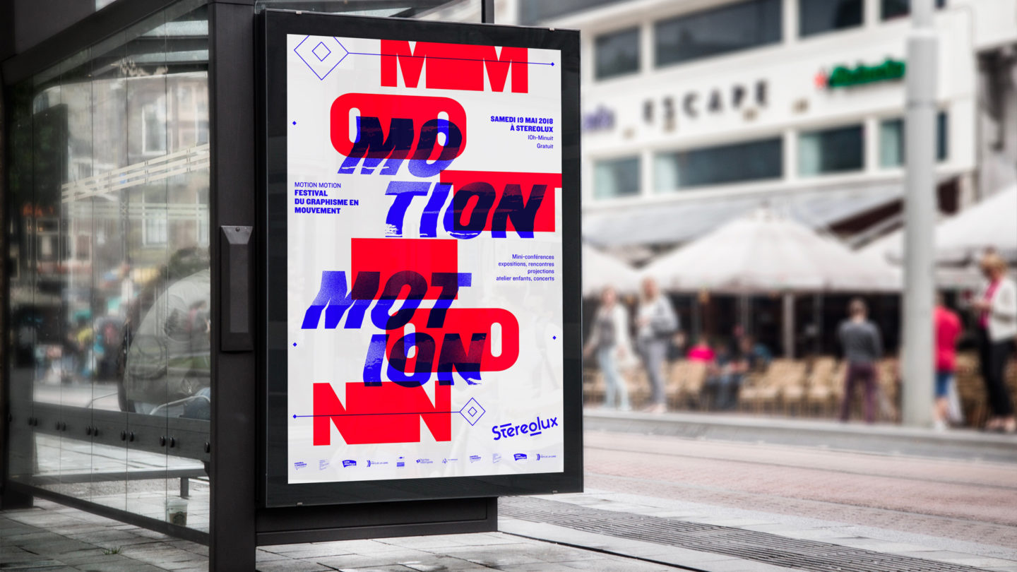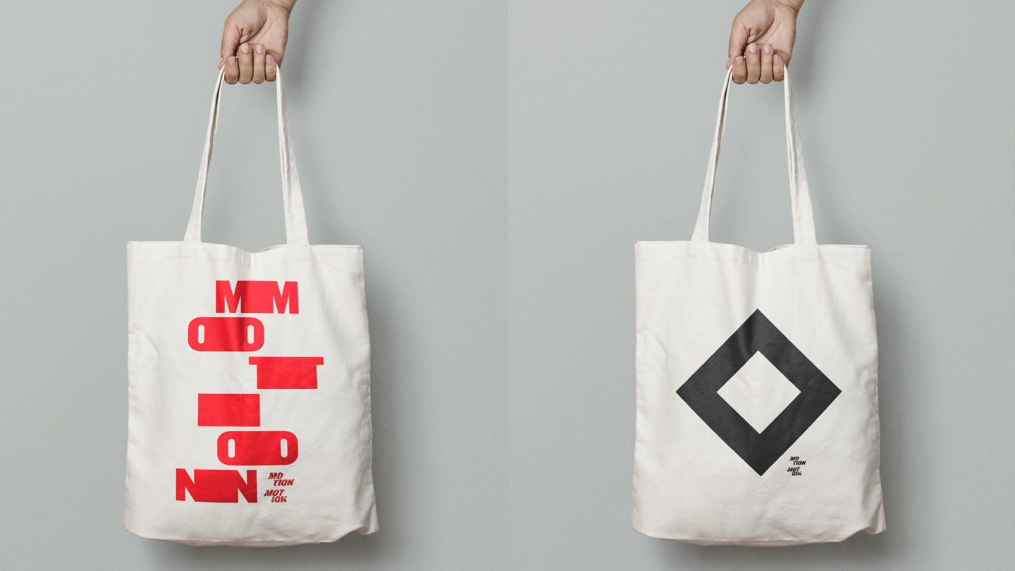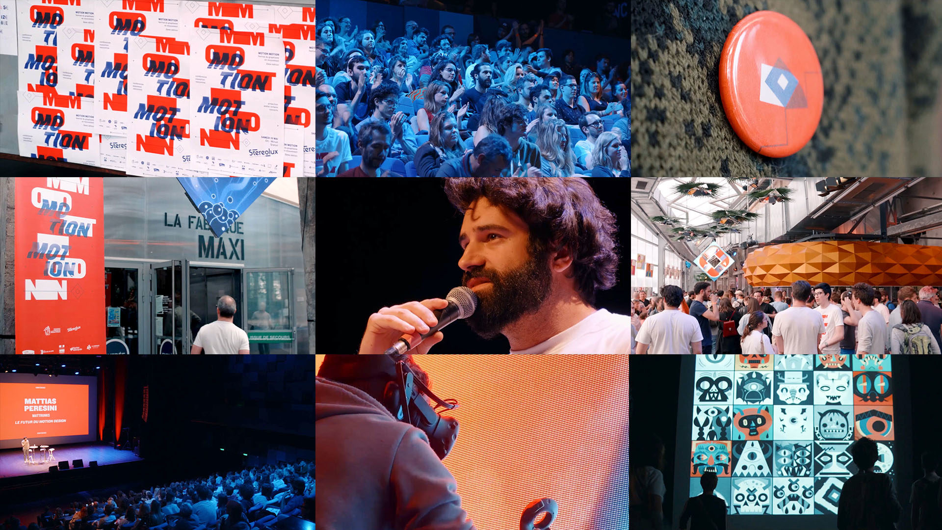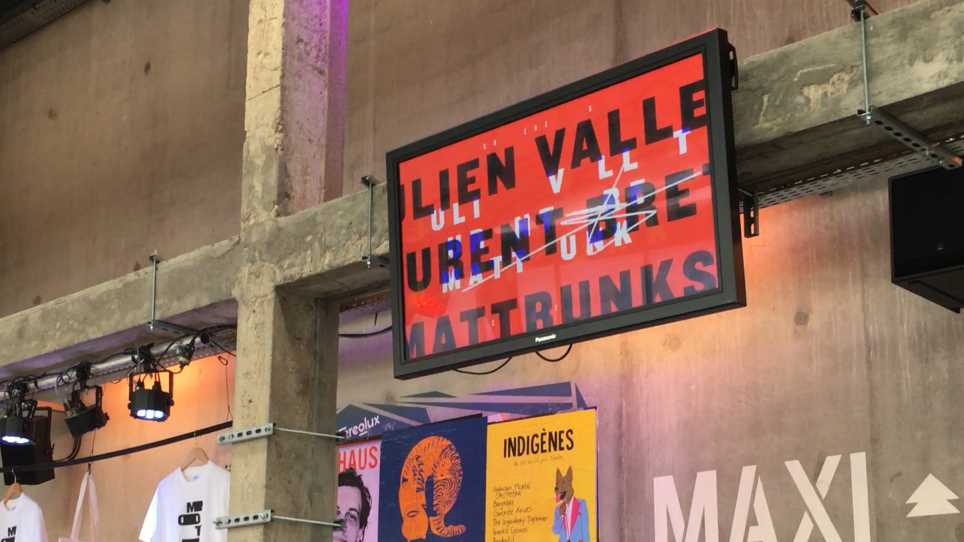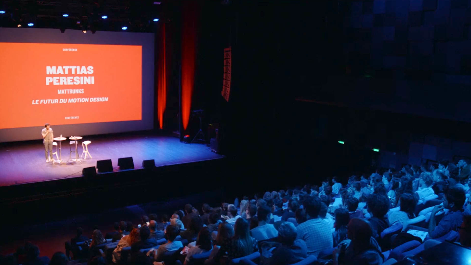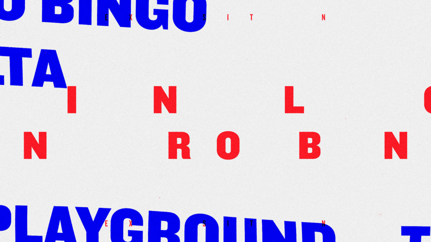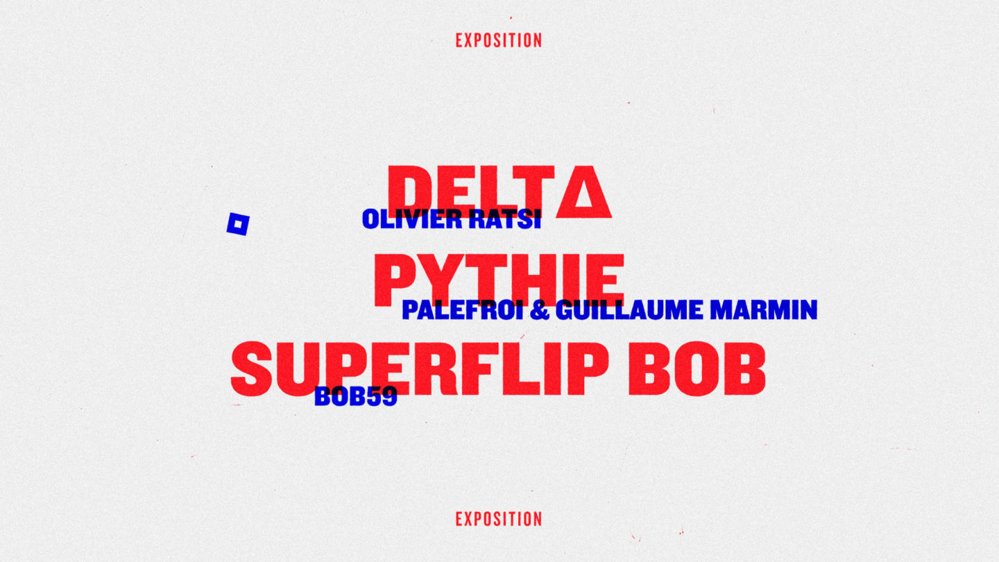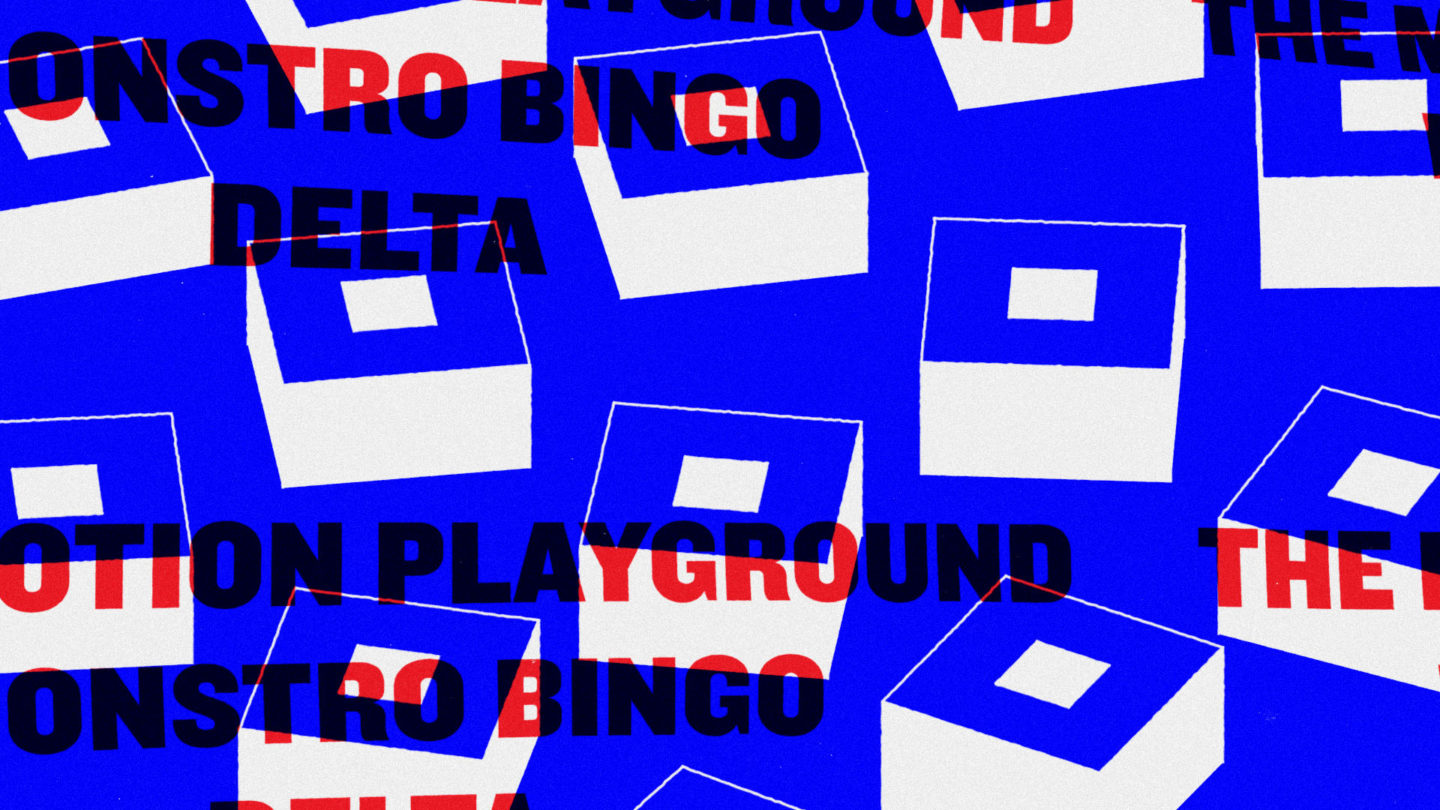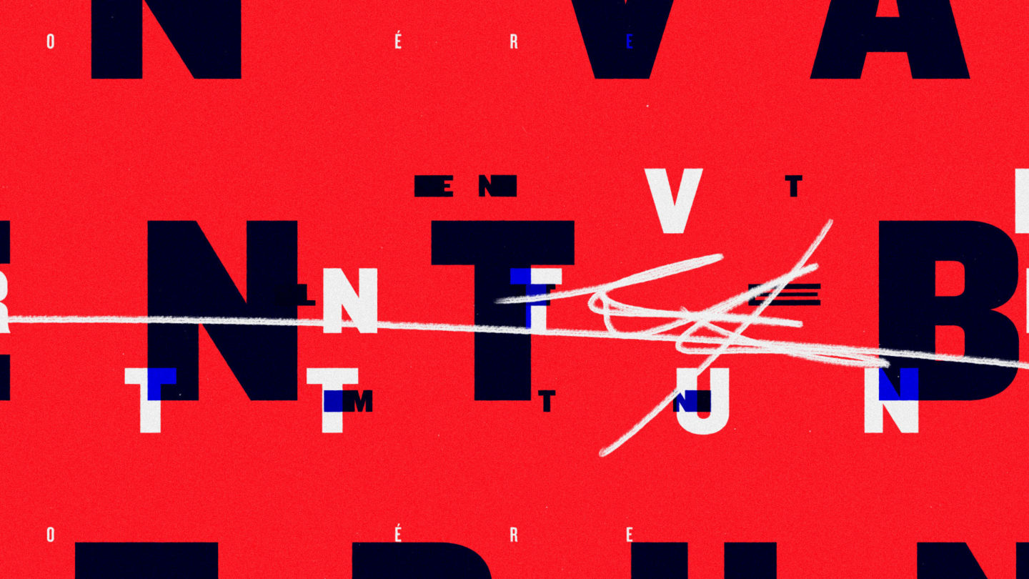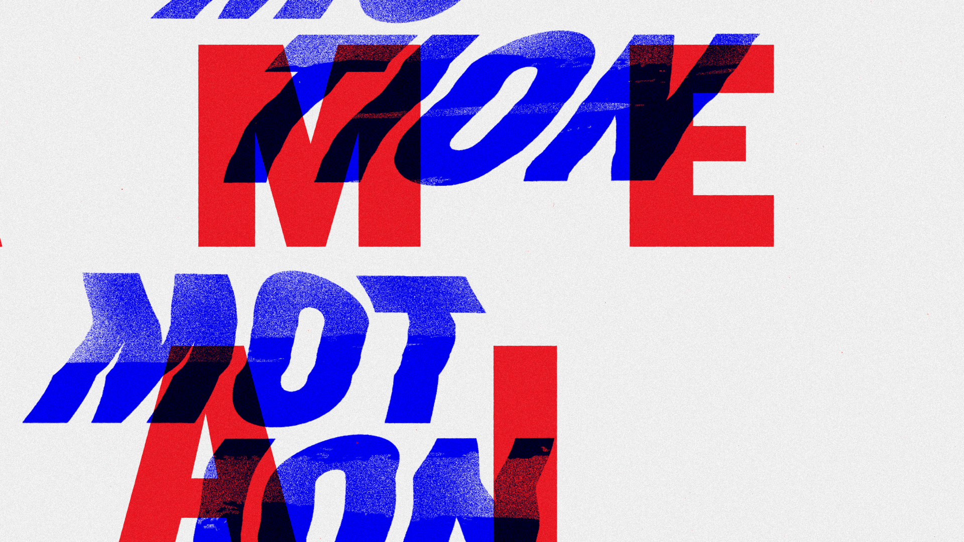
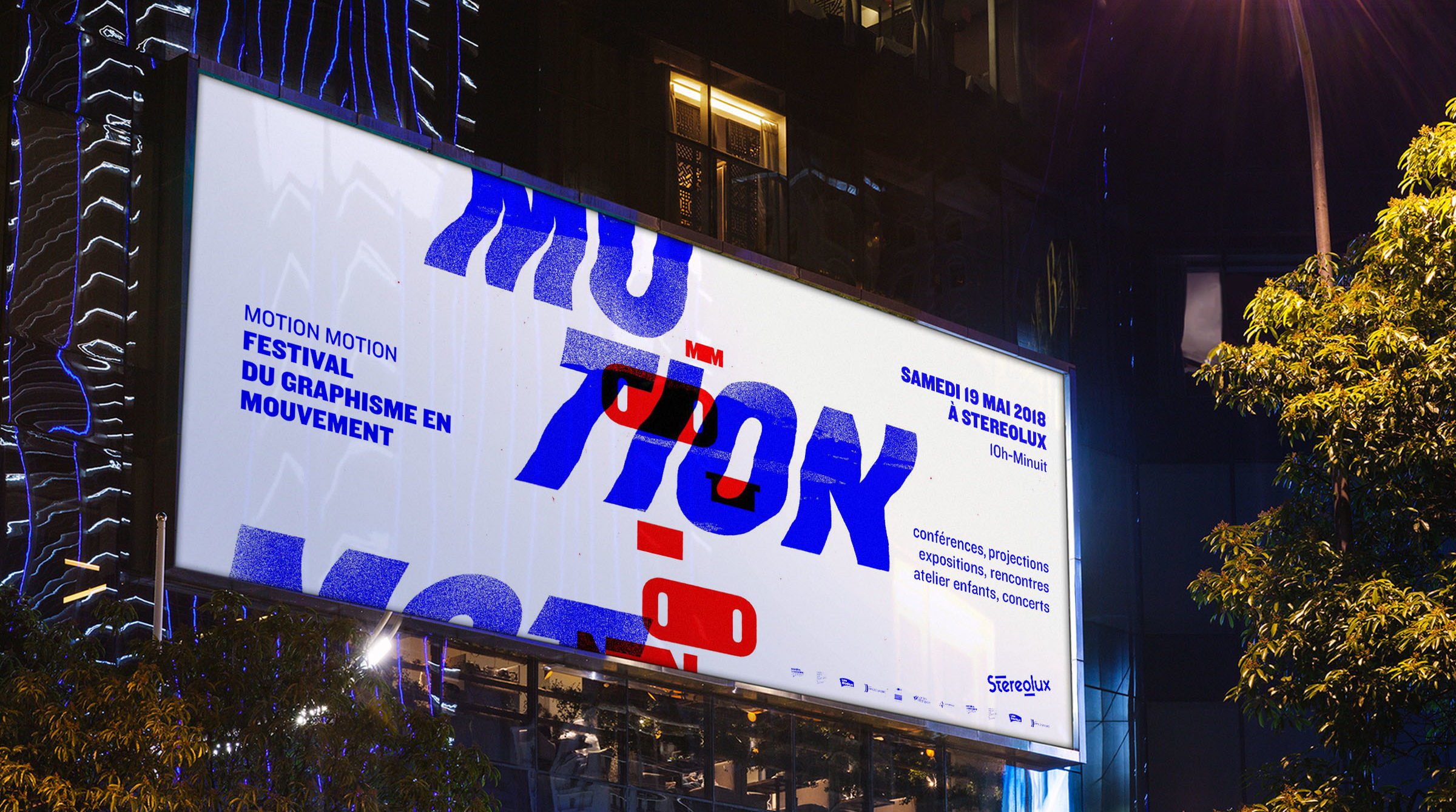
Motion Motion
A festival celebrating motion design: a visual identity built around movement and typography.
Context
Solution
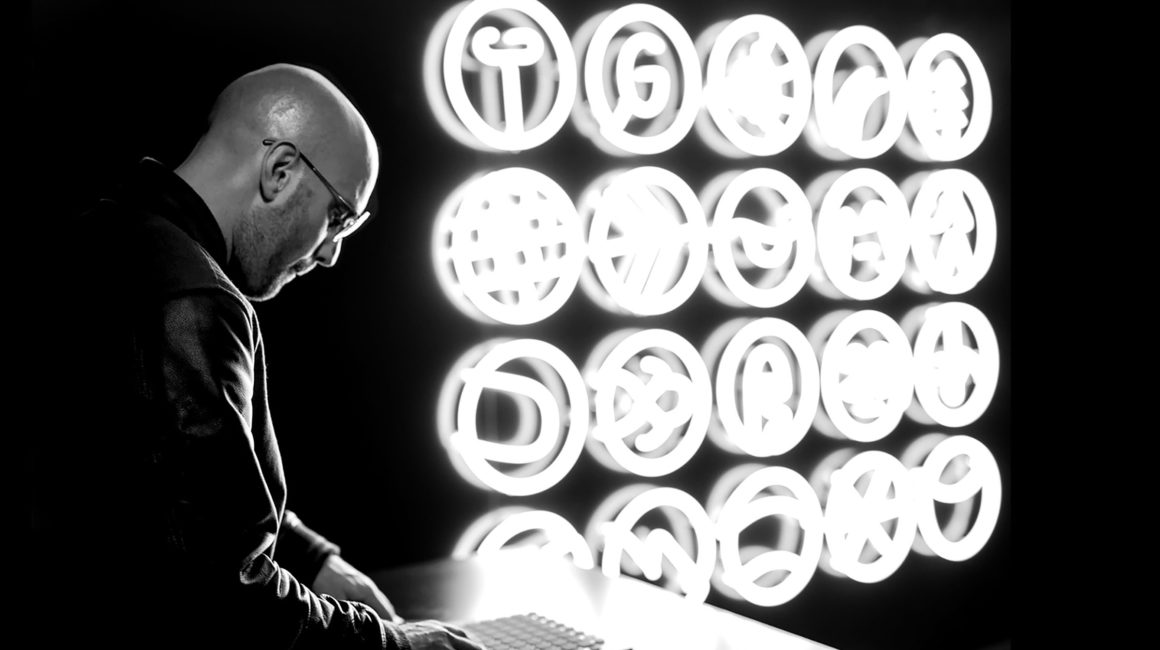
Credits
Direction:
NŌBL
Client:
Motion Motion Festival
Creative direction:
Cyril Izarn & Julien Nantiec
Storyboard/Design/Animation:
Cyril Izarn
Music & sound design :
Mooders
Direction:
NŌBL
Client:
Motion Motion Festival
Creative direction:
Cyril Izarn & Julien Nantiec
Storyboard/Design/Animation:
Cyril Izarn
Music & sound design :
Mooders
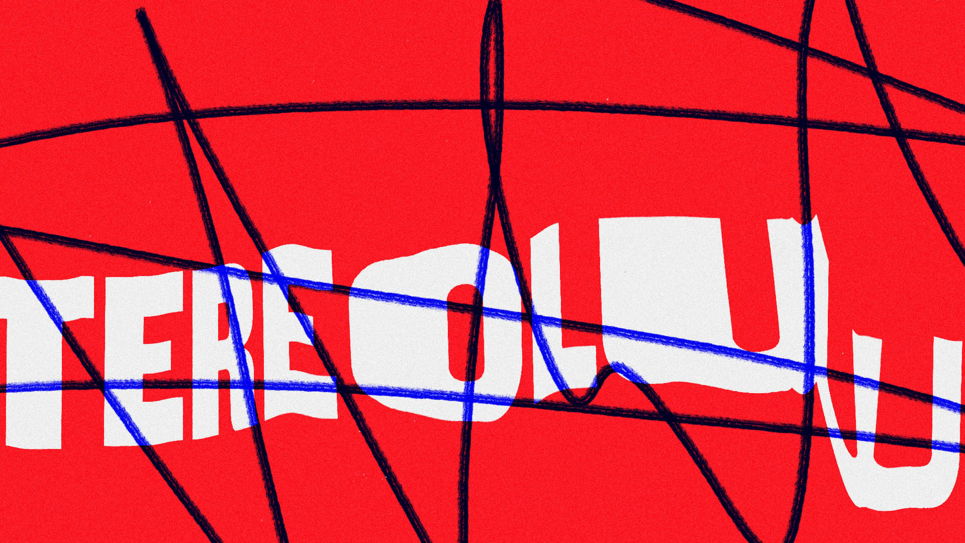
Motion Motion: graphic design in movement